

Vans & Timberland UX Email Conversion Research


Improving ecommerce email strategy through UX research, competitive analysis, and user testing
Vans and Timberland were seeing steady email open rates, but conversion rates remained low. With the holiday season approaching, both brands needed a faster way to understand what was preventing users from engaging with promotional emails and how their email templates could better support click-through and purchase behavior.
As a UX Researcher on a 3-person team, I helped uncover user expectations, analyze current email patterns, and translate research findings into actionable recommendations for stronger email layouts, clearer messaging, and more conversion-focused templates.
Project Snapshot

Role: UX Researcher
Team: 2 UX Researchers + 1 Visual Designer
Brands: Vans, Timberland
Timeline: 6 weeks
Tools: UserTesting, InVision Freehand, Mural, Baymard, Insider Intelligence, Gartner
Methods: Stakeholder Interviews, Competitive Audit, Market Research, Unmoderated Testing, Contextual Interviews, Affinity Mapping, Research Synthesis
Deliverables: Email marketing best-practice guide + 9 improved email template layouts
The Challenge
Vans and Timberland had already tested different approaches to improve email performance, but conversion rates were still not meeting expectations. The core question was:
How might we help ecommerce email teams create more effective, engaging, and conversion-focused marketing emails without slowing down their existing workflow?
The project had a tight timeline because the holiday season was quickly approaching. We needed to work resourcefully, understand what was and was not working in the current templates, and deliver practical recommendations the teams could test quickly.
Business Goals
The primary goal was to support the brands in accelerating email template testing to improve ecommerce performance.
We focused on identifying opportunities to improve:
-
Click-through behavior
-
Email content hierarchy
-
Promotional clarity
-
Personalization and relevance
-
Template flexibility for creative and email teams
-
Accessibility and usability across devices
Key metrics considered included open rate, click-through rate, and revenue per thousand emails.
My Role
I supported the research process from discovery through synthesis and recommendations.
My responsibilities included:
-
Participating in stakeholder interviews with email, creative, and digital experience teams
-
Analyzing current email template pain points
-
Conducting market research on email marketing and ecommerce best practices
-
Reviewing competitor email examples across fashion, retail, and lifestyle brands
-
Supporting two rounds of unmoderated user testing
-
Synthesizing user quotes and behavioral patterns through affinity mapping
-
Identifying key themes around messaging, hierarchy, personalization, and visual clarity
-
Contributing recommendations for modular, conversion-focused email templates
_edited.png)
Timeline of project divided weekly
Research Approach
Because of the compressed 6-week timeline, we used multiple research methods in parallel to understand both internal team constraints and customer behavior.
1. Stakeholder Interviews
We began by speaking with email and creative stakeholders to understand their current process, pain points, and limitations.
Key themes included:
-
Existing layouts felt repetitive across campaigns
-
Copy often felt generic or too literal
-
Creative teams had limited access to flexible assets
-
Teams lacked clear email design best practices
-
Technical constraints limited certain content formats, such as video
-
Email and creative teams needed plug-and-play template options that could be executed quickly
This helped us understand that the issue was not only user-facing. The internal workflow also needed more flexible, scalable template guidance.
2. Market Research
We reviewed email marketing and ecommerce best practices across industry resources and identified three major opportunity areas:
Content
Emails needed stronger hierarchy, accessible typography, clear CTAs, alt text, color contrast, and layouts that were easier to scan.
Relevance
Users responded more positively to content that felt timely, personalized, and connected to their shopping intent.
Transparency
Promotional emails needed to communicate sale details quickly and clearly, including discount percentage, shipping information, start/end dates, and what products were included.
A key takeaway was that accessibility and conversion strategy were closely connected. Clearer CTAs, stronger contrast, live text, and simpler layouts could improve usability while also supporting engagement.

3. Competitive Analysis
I conducted a competitive audit of retail and lifestyle email examples, including brands such as Gucci, Nike, ASOS, and Carhartt.
The goal was to understand how other brands structured promotional emails, used visual hierarchy, presented offers, and encouraged users to click through.
This helped us identify patterns around:
-
Strong hero messaging
-
Clear sale framing
-
Minimal competing CTAs
-
Product-forward imagery
-
Mobile-friendly layouts
-
Promotional urgency
-
Visual consistency between emails and websites
These findings informed the recommendations we later applied to the template concepts.


Describe your image

Describe your image
Examples of the competitive analysis
User Testing
We conducted two rounds of unmoderated testing to understand how users interpreted existing and revised email templates.
Round 1: Existing Email Templates
In the first round, users reviewed existing brand email templates and subject lines. We asked participants to describe their impressions, identify which subject lines they would click, and explain what made certain emails feel more or less compelling.

User quotes synthesized in the Figjam research board
Key findings:
-
Users were most motivated by clear deals and specific discount percentages
-
Personalized subject lines increased interest
-
Free shipping was a strong incentive to open or engage with an email
-
Users preferred short, direct messaging
-
Too many clickable options created decision fatigue
-
Users wanted emails to feel visually connected to the brand’s website
-
Product descriptions needed to be easy to scan and understand
-
One major insight was that users were not looking for more content.
-
They wanted clearer value, fewer distractions, and faster understanding.

Round 2: Revised Template Concepts
The second round tested early versions of new email template designs during peak holiday season. Users reviewed the templates individually to avoid fatigue and provide more focused feedback.
We evaluated:
-
Message clarity
-
Visual hierarchy
-
CTA placement
-
Promotional details
-
Shipping information
-
Overall appeal
-
Likelihood of taking action
Key findings:
-
Free shipping needed to be highly visible
-
Sale details needed to appear earlier in the email
-
Users wanted to know exactly what was on sale, how much the discount was, and when the offer ended
-
Too much text made the email feel overwhelming
-
Too many graphics made the email feel busy
-
Holiday-themed emails needed to make the seasonal connection obvious
-
The main image, headline, body copy, and CTA should appear within the same viewport when possible
-
This round helped us refine the templates around clarity, scannability, and conversion intent.

User quotes synthesized in the Figjam research board

Contextual Interviews
We also conducted two rounds of contextual interviews to understand how users interact with brand emails during both off-season and holiday shopping periods.
During off-season, users were more selective and less tolerant of frequent promotional emails. During holiday season, users expected more frequent emails but wanted them to feel more useful, relevant, and visually engaging.


Affinity mapping for rounds 1 & 2
Key themes included:
-
Users care more about relevance than brand storytelling alone
-
Frequency becomes more acceptable during peak shopping periods
-
Product images often perform better than on-model images because users can imagine the product in their own life more easily
-
Visual tone and seasonal mood can help users understand why they are receiving a specific email
-
Users are more likely to engage when the offer, product, and CTA are immediately clear
These interviews helped us balance marketing goals with actual user behavior.

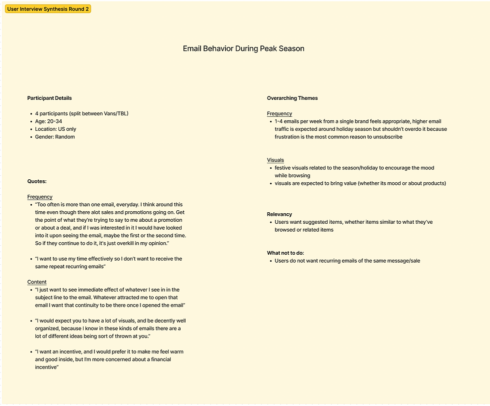
Synthesis for rounds 1 & 2
Key Insights
Across stakeholder interviews, market research, competitive analysis, user testing, and contextual interviews, we identified several major insights:
1. Clarity drives engagement
Users wanted emails that quickly communicated the offer, product, and next step. Vague subject lines, buried sale information, or unclear CTAs reduced interest.
2. Personalization matters, but relevance matters more
Users responded positively to personalized or timely content, but only when the email clearly matched their shopping needs.
3. Free shipping is a major conversion cue
Users consistently identified free shipping as an important purchase motivator. It needed to be visible, clear, and easy to understand.
4. Simpler layouts reduce friction
Users preferred emails that were easy to scan, visually focused, and not overloaded with graphics, text, or competing links.
5. Internal teams needed flexible systems
The brands needed templates that were not only user-friendly, but also practical for email and creative teams to execute quickly.

Recommendations
Based on the research, we recommended that future email templates should:
-
Lead with the strongest promotional message
-
Make sale details visible within the first viewport
-
Use clear, direct subject lines with specific discount information
-
Prioritize one primary CTA
-
Keep layouts clean and easy to scan
-
Use product images strategically to support user imagination and decision-making
-
Treat free shipping as a high-value conversion cue
-
Use live text for accessibility
-
Maintain strong color contrast and readable font treatment
-
Keep email width and spacing consistent across email clients
-
Create modular components that teams could mix and match across campaign types
Final Deliverables
At the end of the project, we delivered:
-
A research-backed email marketing best-practice guide
-
9 improved email template layouts for testing
-
Recommendations for holiday, sale, and collection-based campaigns
-
Guidance on accessibility, CTA treatment, imagery, spacing, hierarchy, and modular template usage
The final templates were designed as flexible, plug-and-play components that could help Vans and Timberland test new email strategies faster while maintaining brand consistency and improving the user experience.


Plug & play template options
Impact
This project helped the brands move from assumption-based email design toward a more user-informed testing strategy. By combining stakeholder input, user feedback, competitive analysis, and ecommerce best practices, we created practical recommendations that supported both customer needs and internal team workflows.
The final outcome gave brand teams a clearer foundation for testing email layouts that were more accessible, easier to scan, and better aligned with conversion-focused ecommerce behavior.