UX Researcher / Marketer
Portfolio
Vans & Timberland UX Email Marketing

Opportunity
Vans and Timberland's open-rates were steady, but conversion rates were extremely low. Both brands have conducted their own testing to resolve this issue but to no avail. As a researcher on this project, I was able to support the brands in accelerating testing emails that have higher conversion rates.
Outcome
Delivered industry best practices regarding emails for marketing to drive conversion and 9 improved email template layouts for the brands to test.
Role
UX Researcher
Tools
InVision Freehand, Mural, UserTesting, Baymard, Insider Intelligence, Gartner
Skills
Gap Analysis
Competitive Audit
User Testing
User Interviews
Affinity Mapping
The Kick-off Meeting
I was part of a team of three, which included another researcher and a visual designer. We had a meeting with the VP of Digital Customer Experience and Design to discuss the project's goals, pain points, and expectations for Vans and Timberland. The main issue was that, despite steady open rates, conversion rates were unacceptably low. As the holiday season, which is the busiest and most profitable quarter for e-commerce, was quickly approaching, we had to work resourcefully to address this challenge.
Kick-off Takeaways
Expectations
-
Primary focus is working on templates and getting them in the water
-
Find out what is working with the current templates and what isn't
-
Best practices doc on emails for marketing to drive conversion
-
Multiple templates for emails to test and iterate, created in Sketch (or Figma)
Risks
-
Dependency on creative
-
Constrained with existing assets
-
-
Lack of copywriting and visual design
-
Can’t make changes to creative messaging and high risk that we cant get new assets to work with, could be constrained
-
The Plan
We quickly put together a research plan due to the sensitive timeline. This project was ambitious as it required regular department meetings with the brands, stakeholder interviews, and well as user testing and interviews with iterative designs all within a 6 week span.
Goal: Support brands in accelerating testing emails that have higher conversion rates
Hypothesis: Dynamic content that holds more narrative arcs could drive open rates, clickthrough rates, and RPM up.
Multiple templates that offer quick and easy 'plug n' play' solutions could help the email and creative teams execute the email process easier allowing more time to strategize for storytelling opportunities.
Metrics: Open Rate, Clickthrough, RPM

Timeline of project divided weekly
Stakeholder Interviews
We conducted stakeholder interviews with the brands and aimed to learn about their email process, analytics, benchmark testing, and any existing pain points. The interviews were conducted for one hour with stakeholders on the email team and 30 minutes with the creative team. Our goal was to ensure that each stakeholder felt valued and heard throughout the entire process, and to be transparent about our own work.
Interview Takeaways
-
External copywriter - Copy feeling generic or too literal and lacking unique messaging
-
Limited layouts that is causing repetitiveness across the board
-
Lacking proper access to assets and unable to get specific in the feedback loop
-
Running into layout issues like stacking and spacing issues
-
Technical constraints such as unable to support videos
Creative
-
No rule for best practices, unable to implement new ideas and templates
-
Working with minimal resources
-
Toolkits are very specific and not much wiggle room on global brand emails
-
No in-house copywriter
Diving Into the Market
We took a deep dive looking into email marketing best practices that were out in the wild, specifically guidelines regarding subject lines, email layout and visuals. We found tons of insights from resources like Email on Acid, MailChimp and Campaign Monitor.
We quickly realized that some of the recommended practices went hand-in-hand with accessibility. We knew that one of our quick wins were to emphasize the importance of the brands to adhere to ADA guidelines such as font treatment, CTA treatment, alt text, and color contrast. We wanted to make sure that the brands understood how critical accessibility is for the business. Considering accessibility meant being more inclusive, improves usability for everyone, and it increases engagement and retention.
In summary, we categorized the market research into 3 buckets:
-
Content: This bucket consists of recommendations for accessibility and visual components such as: alt text, font treatment, CTA treatment, color contrast as well as hierarchy and visual layout.
-
Relevancy: Newsletters that delivered highly personalized and relevant content at the right time received the most positive emotional responses from recipients.
-
Transparency: Users want full transparency when receiving emails with wording that is straight to the point and kept at a minimum.

Overview of market research findings
Competitive Analysis
Based on what I learned from the market research, I applied my knowledge by conducting a competitive analysis and determined what our competitors were doing well and what we would’ve done differently.
Shown below are examples of the competitive analysis I conducted between Gucci, Nike, ASOS and Carhartt.


Click to enlarge image
Unmoderated Tests
Round 1

13
Questions & Tasks
7
Participants
We conducted 2 rounds of unmoderated tests.
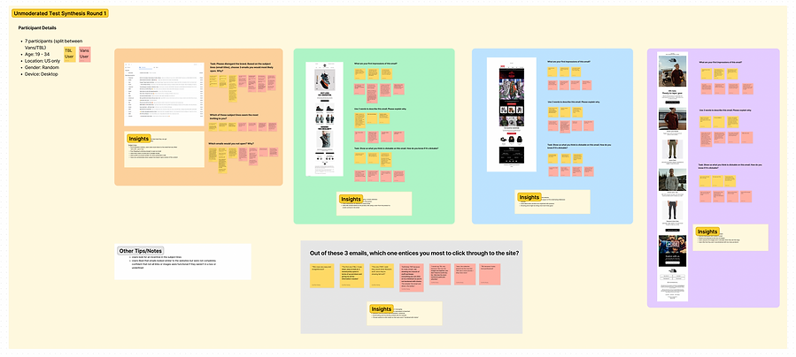
Round 1 was launched before the holiday emails began. We had users compare between 3 different existing brand email templates (TBL, Vans, TNF). We gave users tasks like: describe the templates in three words and why they chose those words (phrases).
We also provided an image of a live email inbox and had users choose 3 subject lines they would click through. which ones they would avoid and why.
From this test, we were able to determine users' priorities, painpoints and preferences.

User quotes synthesized in the Figjam research board
Round 1 Unmoderated Test Takeaways
Content
Types of Emails
-
Consumers prioritize looking for the best deal they can get
-
New Arrivals emails came secondary
Subject Lines
-
Personalization matters, users were most drawn to the email that was titled “25% OFF, Just 4 You”
-
Free Shipping is enticing enough to open an email
-
Users don’t seem to mind use of (single) emojis
-
Users prefer an actual number (%) when presented a sale (not % ranges or $ amounts)
-
Users are uninterested when subject line doesn’t give context of the content
“They stick out to me in terms of a hard number, the percentages off and not just “up to”.”
Visual
What Users Like
-
Attention grabbing, short and direct messaging
-
Easily digestable collection/product description is important
-
Relevant content/theme (personalization, seasonal)
-
Email looking and functioning similarly like the website
-
Choose options to click wisely so that users aren’t “burdened with choice”
"Its really simple, not showing me a bunch of stuff and keeps everything you can click on to a minimum so you’re not burdened with choice. The simpler the email and direct, the better.”
Round 2

9
15
Questions & Tasks
Participants
Round 2 was launched during peak holiday season to test the first version of the 3 new email template designs based on data we collected from our users.
We tested each template separately to widen our pool and to avoid fatigue for our users. Users were asked about placement, determine the main message of the email, potential actions and visual preferences.
I synthesized the data by putting user quotes on stickies on Figjam to look for common themes.

User quotes synthesized in the Figjam research board
Round 2 - Unmoderated Test Takeaways
General Insights
Overwhelming Aspects
-
Too much text/the message isn’t straight to the point (body of email)
-
Too many graphics, it feels too “busy”
-
When there isn’t a statement that gives a overview of what the email includes (subject line)
Free Shipping
-
For most users, free shipping is essential when determining to buy a product. This information should be displayed prominently as this is considered a high incentive for users.
-
Underline Shipping Banner text if it is an interactive text link
Unsubscribing Behavior
-
Users will not likely unsubscribe or delete an email because of content, but rather unsubscribe when frustrated by the frequency of emails from a single brand.
Template Insights
-
Free shipping stood out to users before noticing the main message.
-
Consider user priorities when determining hierarchy of content. Users thought the email was bland because it didn’t give emphasis to the sale and misleading because such a sale was towards the bottom of the email.
-
Users want sale details to be clear and transparent straightaway. (Include what is on sale, the discount % offer, shipping info, online/in-store, when it starts and ends.)
-
Make the main image + h1 + body copy + CTA within the same viewport
-
If the email is based on a theme (like holidays), make it obvious and apparent so that it is clear why the user is receiving the email.
Contextual Interviews

Round 1
3
Hours
6
Participants
We conducted 2 rounds of contextual interviews.
The first round was a considerable amount of time before the holidays determine users' attitudes and expectations for email behavior during off-season.
These interviews were outlined with 5 main questions but were mostly conversational. I pulled significant user quotes onto stickies in Figjam and conducted an affinity mapping exercise with my peers to investigate trends or patterns.


Affinity Mapping and Interview Synthesis
Round 2

2
4
Hours
Participants
The second round was conducted during the influx of holiday emails to measure behavior during the peak season. We wanted to determine the different thresholds that users would expect between the two different timeframes. We also discussed expectations, painpoints and preferences when it comes to holiday emails. I also used this opportunity to try to dig for areas I hadn't reached from the first round through our users.
I affinity mapped with user quotes again, just to see if we had any differentiating themes from the first round and how the answers changed depending on the circumstance.


Affinity Mapping and Interview Synthesis
Overarching Themes
We recognized four themes from both rounds of contextual interviews. The circumstances of off season and holiday season varied mostly with frequency and visually when it came to personalized content.
From what we learned, brand storytelling is an opportunity to drive personalization. Subscribers are more concerned about relevancy and care very little about storytelling.
During peak season, users expected more frequent emails due to holiday sales and gift giving. They also spoke about how they want to feel a sense of brand connection through visualization to help communicate value; this can be through an overall mood/tone or product images.
Subscribers also reacted more positively to product images over on-figure images, because it was actually easier for them to picture the product on themselves. Not everyone looks like the models in the images so it can be harder for some to imagine that product on them or picture it outside of what it is paired with.

Iterative Design Templates
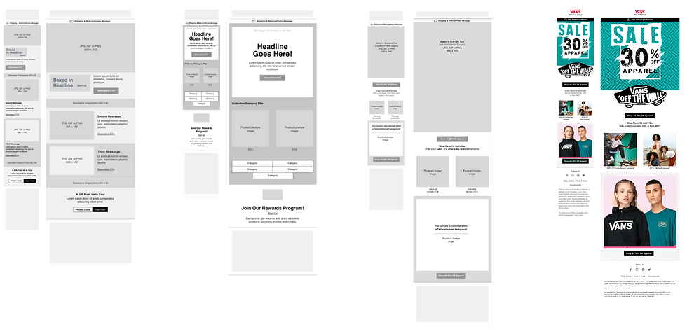
Along with industry UX marketing best practices, we delivered 9 versions of iterative design templates for the brands to test. All components can be used interchangeably to deliver clean and focused emails.
With the designs, we had key notes for the brands to keep in mind:
Fonts - When choosing the best fonts for your email, you must select an email-friendly font available across all devices and mediums. If using custom fonts, your email design may look differently than you intended it to.
CTAs - Your CTA design is a visual cue, so make them easy to click across devices. Your button should stand out from the rest of the content.
Use live text, so CTA's are always accessible
Images - Use images to support your message not tell the whole story.
Margins and Spacing - We've discovered through testing and competitive analysis that emails over 600 for desktop have a tendency to display differently on email clients and create an undesirable layout.


